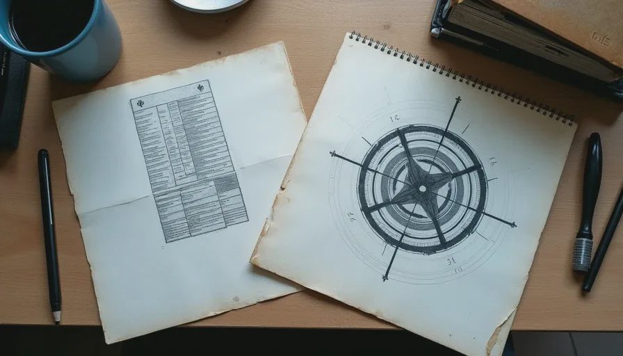
Clunkiness is the word most often used to dismiss older interfaces. The menus take too many inputs. The inventory requires deliberate rearrangement. The pause screen drops the player into a separate visual language. The status information is sparse or awkwardly placed. Modern design has spent years removing these frictions in the name of clarity and speed. The improvements are real. What is less often examined is the secondary function those older interfaces performed: they kept scarcity, weight, and continuous low-level decision-making visible.
Sixth-generation UI was shaped by memory limits, controller constraints, and the need to keep the player inside a coherent systemic language. The results were frequently slower and less elegant than contemporary solutions. They were also more consistent with the worlds they served. A limited inventory grid did not exist only to frustrate. It made carrying capacity a persistent condition rather than an occasional inconvenience. Every pickup became a small act of evaluation. Every full screen forced a judgment about what still mattered. The interface itself enacted the same scarcity the game’s fiction claimed.
I notice the difference most clearly when I move between an original and its later revision. The updated UI is faster to parse and kinder to the hands. It also asks less of my attention between the larger story or combat moments. The older version keeps a quiet cognitive tax running at all times. That tax was part of the temperature.

Friction as Continuous Information
A classic limited inventory did more than restrict items. It turned resource management into a spatial and temporal practice. Items occupied visible slots. Combining or discarding required navigation. The screen itself often used the same visual language as the world—muted colors, mechanical frames, sparse typography—so that opening the menu did not feel like leaving the environment. The player remained inside the game’s material logic even while performing administrative tasks.
Modern radial menus, quick-select wheels, and expanded automatic inventories remove most of that administration. The gain in speed is obvious. The loss is the constant low-level reminder that capacity is finite and choices have weight. Scarcity becomes something the game declares during scripted sequences rather than something the player feels through repeated small acts. The interface stops participating in the world’s pressure and becomes a neutral tool for accessing systems.
The same pattern appears in status and map screens. Older designs often required the player to enter a separate mode and read limited information carefully. The act of checking health, ammunition, or location carried a small cost in time and attention. That cost encouraged a more deliberate rhythm. Contemporary HUDs and contextual prompts keep critical data available at a glance or on a quick toggle. Convenience increases. The need to decide when to look away from the world decreases. The player’s attention remains more continuously outward and less frequently reflective.
Immersion Through Shared Language
Many sixth-generation interfaces refused to adopt a clean, parallel visual style. They borrowed the textures, color palettes, and mechanical motifs of the game world. A pause screen might look like a piece of diegetic equipment. An inventory might feel like a physical case with limited compartments. The clunkiness of navigation reinforced the sense that the interface belonged to the same reality as the environments. Modern UI design usually prioritizes legibility and platform consistency over that continuity. The menus become elegant, translucent, and fast. They also become more clearly separate from the world they serve.
This separation is not neutral. When the interface feels like a contemporary overlay rather than an extension of the game’s material rules, a layer of immersion thins. The player moves more easily between “playing” and “managing.” The older, clumsier systems made management feel like a form of playing that still obeyed the same constraints. The difference is subtle in any single moment and cumulative across a full session.
I am not defending every awkward cursor path or every excessively nested submenu. Some of the clunkiness was simply poor design or the result of rushed implementation. The useful distinction is between friction that was incidental and friction that was structural. Structural friction kept the player’s decisions aligned with the game’s claimed pressures. Removing it in the name of quality-of-life can leave the systems intact while changing the felt relationship between player and scarcity.

The Attentional Cost of Cleanliness
For an adult player with limited evening hours, the calculation is practical. A cleaner interface allows more of the game to be experienced inside the available time. It also tends to distribute attention more evenly and more thinly. The older interfaces concentrated attention through repeated small demands. Those demands could feel tedious. They also produced a denser sense of continuous presence inside the game’s logic.
The case for old UI is not a call to restore inconvenience for its own sake. It is a recognition that certain forms of clunkiness once carried information and weight that modern clarity often discards. Limited slots, deliberate navigation, and visually consistent menus kept scarcity and material logic visible at every scale of interaction. When those elements are streamlined, the game becomes easier to recommend and, in a measurable number of cases, less itself.
I still open the older menus with a particular kind of attention. They ask for a few extra inputs. They make me look at what I am carrying and decide whether it still matters. That small ritual remains one of the clearer differences between a system that treats the player as a manager of convenience and a system that treats the player as a participant in scarcity. The clunkiness was never only clunkiness. It was one of the ways the design kept its own rules audible between the larger moments of action.




No notes yet — write the first one.