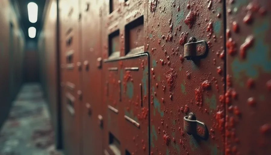
A texture in a modern horror game is usually asked to do one primary job: convince the eye that the surface is made of something real. High-resolution maps, careful material response, and accurate wear patterns all serve that goal. The result can be impressive. It is rarely unsettling in the specific way older textures could be.
Sixth-generation horror worked under different rules. Texture memory was finite. Resolution was low by current standards. Artists could not place a unique, highly detailed material on every surface. They had to choose what to emphasize, what to repeat, and what to leave ambiguous. Those choices turned textures into active participants in the atmosphere rather than neutral background information. A repeating stain, a soft blur at the edges of a wall, a compression artifact that made organic matter look slightly wrong—these were not failures of fidelity. They were the available language for suggesting that the environment itself was unstable or contaminated.
I notice the difference most clearly when I return to certain PS2 and original Xbox titles and then look at later remasters or spiritual successors. The newer versions supply more visual data. The older ones often supply more unease per pixel.
Scarcity and the Suggestion of Decay
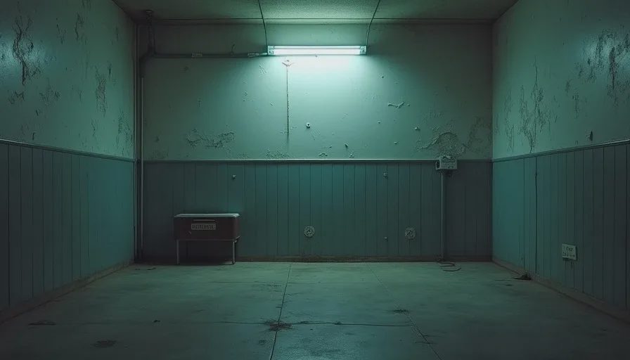
When an engine can only afford a limited number of unique textures, repetition becomes inevitable. In a conventional game that repetition is a problem to be hidden. In horror it can become a feature. A corridor lined with the same stained panel texture creates a subtle visual rhythm that the eye registers as unnatural even before the player consciously notices the tiling. The repetition suggests industrial indifference or institutional neglect. It also suggests that the space was not built for comfort or for the player’s arrival. Modern unique materials remove that rhythm. Every section of wall can carry its own story of wear. The environment becomes more varied and, in many cases, less oppressive.
Low resolution performed a similar service. A texture that resolved only to a certain level of detail forced the player’s imagination to complete the surface. Bloodstains, rust, mold, and organic growths remained partially abstract. The mind filled in the missing information with its own associations, which were often worse than any explicit depiction. High-resolution textures close that gap. They show the player exactly what the substance is and how it sits on the material beneath. The clarity can be more disgusting. It is frequently less suggestive. Suggestion was one of the primary tools sixth-generation horror had available, and limited texture detail was one of the ways it was enforced.
Fog and darkness worked in partnership with these surfaces. Because draw distances and fill rates were constrained, developers used atmospheric effects to hide the point at which textures would break down or repeat too obviously. The same fog that managed technical limits also kept the player from ever seeing a surface in full, stable light. Textures remained conditional. They changed character as the player moved or as the light source shifted. That instability is harder to maintain when every material is fully readable at any distance under modern lighting.
Material Wrongness and Compression
Some of the most effective textures of the era were not carefully authored art so much as the visible result of compression and color-depth limits. Certain organic surfaces took on a slightly melted or posterized quality. Skin, meat, and damp fabric could look as if they were losing structural integrity. These artifacts were not intentional in the way a concept artist might plan them today, yet they contributed to a pervasive sense that the world was decaying at the level of its basic materials. The hardware was showing its strain, and the strain registered as environmental illness.
I have spent time comparing original textures side by side with their remastered replacements. The newer versions are cleaner, more consistent, and more physically plausible. They also lose the specific digital decay that once made a simple wall feel contaminated. The original compression errors functioned as an unintended but coherent layer of wrongness. Removing them is a technical improvement. It is also an atmospheric subtraction.
The same principle applies to UI and inventory textures in many of these games. The menus themselves often carried the same limited palette and soft edges as the world. Opening the inventory did not transport the player into a clean, separate interface. It kept them inside the same material language. Modern UI design usually prioritizes legibility and brand consistency over that continuity. The older approach was less convenient and more immersive in a specifically unsettling way.

What the Upgrade Path Leaves Behind
When a horror game from this period receives a remaster, texture work is almost always listed among the primary upgrades. The new materials are sharper, the mapping is more accurate, the surface response is more sophisticated. Players can see more. What they can no longer see is the original negotiation between artistic intention and technical limit. That negotiation produced a particular density of suggestion that higher fidelity does not automatically replace.
I am not claiming that low-resolution textures are inherently superior. Many of them were simply the best the hardware could do. The point is that the limitations forced a design attitude in which every surface had to carry more than its literal appearance. A texture was never only a texture. It was a carrier of scarcity, of repetition, of partial information, of visible digital strain. Those qualities aligned unusually well with the goals of horror.
Contemporary games can still achieve strong material unease. They do so through different means: more elaborate shader work, dynamic effects, higher-resolution photography of real decay. The results can be powerful. They rarely feel like the same kind of pressure. The older textures remain instructive because they demonstrate how little visual information was sometimes required to make a space feel fundamentally wrong. The hardware would not allow more. The designers made the restriction legible as dread.
That legibility is what I keep returning to. In an era when most surfaces are asked only to look correct, the older ones still look purposeful. They remind me that atmosphere is not produced by the volume of detail alone. It is produced by the decisions about what to withhold, what to repeat, and what to leave slightly broken. A texture is never just a texture when the entire system around it has been tuned to make the player doubt the stability of the world. The sixth generation, working with far less memory, understood that principle with unusual clarity.





No notes yet — write the first one.